We live in a world where we are constantly bombarded with data. Data from different sources about different topics and showing different results. How is one to parse through this constant assault to get high-quality data that is accurate and relevant to what concerns us? In this article, I will discuss how to determine if a data source is reliable and if the data is accurately depicting the concluded results.
Before I begin the dive into the core of this article, I want to quickly bring up the inspiration for writing it. The other day a Linkedin post was shared company-wide at Inflection Poynt. This post was made by Jason Miller, a professor at Michigan State University in the college of business. The full article can be seen here, but it begins with the sentence, “Is there a “shortage” of truck drivers?” Now working in the trucking industry, we have all most likely heard about a so-called trucker shortage. It seems from his use of quotations around shortage that he will disagree with something about the perceived trucker shortage. Upon reading further and diving into the comments, something didn’t seem quite right about this post. See if you can spot what the issue might be before reading further.

Let us start with what looks right—the data source. When looking at data, it is important to start here. Our source is the foundation that makes it possible to trust the data we are looking at and ultimately lets us draw conclusions from the data. But what are good data sources? Good data sources depend on how the data was collected, and a few main factors impact this. Is the data current, from a large sample size, and was the collection unbiased?
When drawing conclusions from data, it is essential we have the most current data possible. While looking back at historical data can be helpful with drawing trends, you need current data to be able to extrapolate from that historical data. Large sample sizes can limit many problems that data can have. It limits the impact of outliers and can play a part in reducing bias, to name a couple. Biases are a huge issue when it comes to data. Say someone is polling about political beliefs across the USA and only targets either red or blue states when collecting data. Their results will be clearly skewed, and any results drawn will be off. Part of combating data biases is to examine who collected the data. Do they have an interest in a specific result? While this does not always rule out data, we must look closer at their methodology. Our original post was written by a business professor who is making the claim that no driver shortage exists. Still, his data is collected from the Bureau of Labor Statistics. Government agencies are excellent sources for data as generally they have massive sample sizes, have no bias, provide at least yearly data updates, and are publicly available, meaning others can double check your claims.

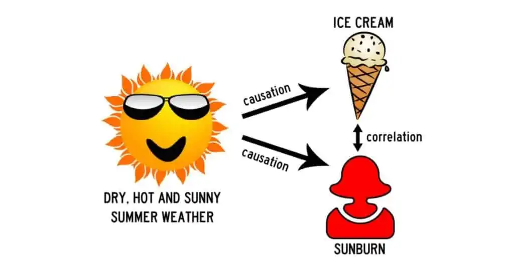
Now that we have verified our data source is good, how do we know if we can draw the conclusions that we have from it? Here it is essential to understand the difference between correlation and causation. A famous example of the difference between these two concepts is the statement that people getting a sunburn makes people want ice cream. These two things are correlated, but having a sunburn clearly does not cause people to want ice cream. Instead, hot, dry, sunny days cause both people to want ice cream and people to get sunburns. Though a somewhat silly example, it is easy to see how a significant rise in sunburns and a significant rise in ice cream sales at the same time could lead people to draw this conclusion. When working with more complex data, it is even easier to confuse these two concepts.

How does this all relate to the original post we are examining? What is the causation line being drawn? It appears to be that the data being presented shows there is not a driver shortage, at least not in the sense most people understand it. If you dive into the comments, Nathan Fletcher asks for clarification on what the data is actually measuring. Here we encounter our main issue. It is not a pool of data for over the road 53’ truck drivers, nor is it data for all CDL drivers or truck drivers in general. It is “all individuals employed by all truck transportation establishments with at least 1 employee.” This means that included in the data set are truck drivers, sure, but also mechanics, dispatchers, managers, all other office personnel, and anyone else that a truck transportation company employs. Even if the data set hints at no significant drop in workers, it is hinting at no drop of workers spread out across all these categories. There could be a drop in truck drivers with an increase in office personnel. We cannot know for sure with the data being provided. AT BEST, we can say there could be a correlation between the data and no driver shortage, but that is a long way from causation.
This is why it is so important to study where data is coming from and draw your own conclusions. It would be easy to say that because Dr. Miller is a business professor using government data, his conclusion must be valid. Still, it appears he has misinterpreted the data and drawn conclusions it does not support, something that is far too easy to do.

Here at Inflection Poynt, our team of experts provides only the highest quality of data, gathered from reliable data sources, to support your hiring needs. We also provide an understanding of said data so that you and your team can utilize it with ease, knowing that it is data you can trust. If you are concerned with hiring and retaining employees and want to know what the hiring landscape in your area looks like, consider checking out our Market Analytics product today!


